I am a sucker for good typography and I guess that explains why it’s taken me such a long time to figure out what I want when it comes to branding Frog & Pencil.
Thanks to Truly Yours on Twitter, she tweeted about The Hungry Jpeg. Having exhausted my normal typography sites I gave it a look and they have some awesome bundles on offer…and freebies! This in turn led me to Creative Market, where it’s a little like typography heaven and over the past week I must have spent hours looking through thousands and thousands (that’s no lie!) of different fonts.
My incredible hubby (Lewie) is spending most of his free time building my website and together, we now have the bones of the site and it’s looking really lovely. I’m super impressed with his coding skills! However, I’m rather fussy when it comes to design…well, most things really; I’m simply a perfectionist and because of this I’ve been battling with typography choices.
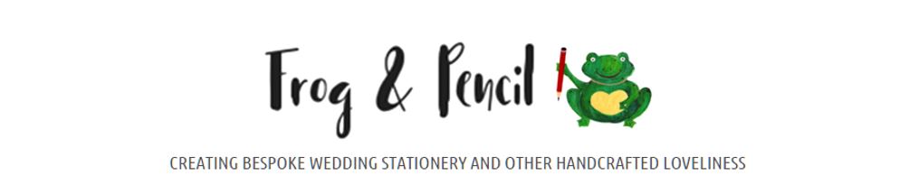
Personally, I love my little frog and her pencil, I think that makes a cute logo. It also expresses my style and what my work is like. So, easy decision, froggy stays. Next step, which font should accompany her? I never, ever thought it would be this difficult to choose one. Lewie and I have spent a lot of late nights playing around with varying fonts and compositions on the website to make it work and I believe we’re almost there; hurrah!
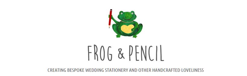
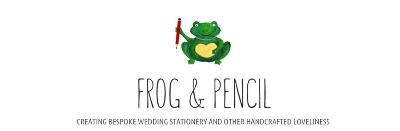
Here is where we started, with the website headers…only a sneak peek though! (Apologies about some poor image quality, most of these are screen grabs.)

Moon Flower Bold
I found myself saying “well, I don’t hate it…” quite a lot during this process which is a glaring signal that something’s wrong. I love tall, skinny typography styles. I think they’re quirky and fit in with my design aesthetic, I even used something similar for my wedding stationery. The problem is, I see this look EVERYWHERE. It must be on-trend right now, this font alone had millions of downloads. So, I pondered, ‘do I do something different?’ I decided to just pile in loads of options and see what sticks…and here are just a few examples.

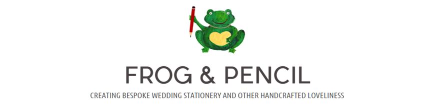
Pier Sans
To me, this font was pleasing to the eye, clean and sat well with the rest of the website but it lacks a little personality. It was helpful in the fact that it made me evaluate what I wanted my brand to represent. Whichever typographic style I choose it needs to meet the following criteria: to be a little quirky, whimsical, appealing to the wedding market and most importantly fun. My designs are fun and I feel it’s essential that this shines throughout my branding too.

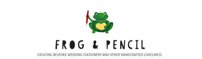
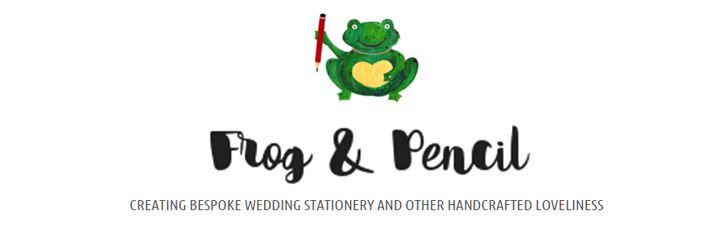
Paper Cute
Paper Cute is rather charming with its cut out appearance and I do like it, however I didn’t feel it was a good fit.

Bohemienne
Bohemienne appealed to me with its lovely brush script style however, somehow, I find it a little too perfect and I see flourishes of ‘Disney’ which isn’t what I was looking for.

Sunn
With Sunn, I thought I would revisit the skinny script, but this isn’t working for me, perhaps I need something a little more punchy and bold.

Farmers Market
I like the varying weights in Farmers Market and there is an element of quirkyness but again, I didn’t connect with it.
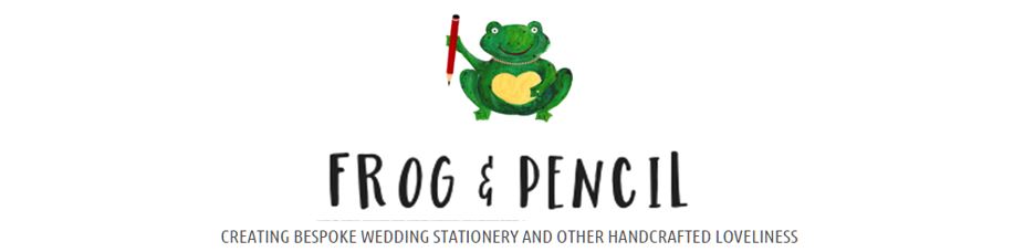
After experimenting with around twenty fonts, I then added these…

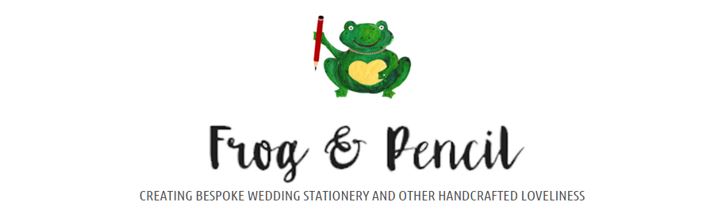
Flow

Monofor Alt
These two were my favourite but I still had those niggles. For example, in almost all my trials it really bothers me that even though everything is centred, the ampersand creates an illusion that, as we would say in Norfolk, everything is ‘on the huh’ (skewed). Alongside that, the tag line also need to fit in nicely and not just hover in space.
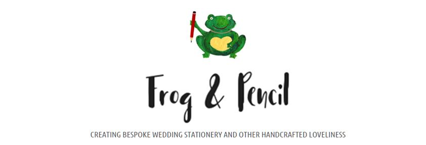
With a few coding tweaks we came up with this.

Flow New

Monofor Alt New
Albeit a smidge delirious, last night felt like a break through after days of banging my head against a typography brick wall. I find these two really pleasing, a bit like eye candy. I enjoy the way these are weighted with the varying thickness. They also have a nice, fluid movement and are not dead straight. It’s almost as if the frog drew them herself as she hopped along.
There is still work to do; I need to choose a colour, finalise compositions and pick the final font. Luckily, they each cost between $10 to $20, so I’ll probably buy both (an added bonus is that they come with a commercial licence, so they’re ready to use in my designs). That way I can work with them accurately, rather than adjusting a fuzzy screenshot. I also need to consider where else my logo might be used. By working with a business card format, this may help me arrive at a conclusion. With that in mind, I started playing with potential business cards ideas.
Phew! I’m feeling much more positive about my branding now. I was starting to worry that I’d never find the right font and that we’d be working on it for weeks, resulting in something that is forced…I’d hate that. With the end in sight, I’m excited about moving on with the website, business cards and designing product packaging!
Fingers crossed, by the end of the week I’ll have a finished result that I can share with you all. I’d love to hear any of your thoughts or suggestions, please share them with me; I appreciate any feedback.
In the meantime, with all this progress, I’m off to do a little happy frog dance!
Cx