Quill London Workshop

Hello all!

I absolutely love Instagram and have spent many an hour scanning it for inspiration. During our wedding planning stage, my account was full of wedding suggestions…but since then it’s all illustrators, makers and puppies (super adorable pups)!

I started to notice images of lovely calligraphy and upon further investigation I discovered these were mainly pictures from workshops. It looked like fun and I thought that this could be a pretty useful skill to have in my Frog & Pencil arsenal, so I decided to give it a whirl!

Way back in early October I found a Beginners Modern Calligraphy Workshop with Quill London. Having zero experience but a love for typography this was the right choice for me, however there are other options for those who have a little skill already. It costs £49 for a 2.5 hour session with refreshments and you get to keep all the equipment you use which I think’s a pretty good price. Now, these guys are popular! I signed up in October for a date in early December, but you’ll be happy to know that they’re always adding new sessions.

Thursday 3rd finally came around and it felt good to get out of Norwich and head to London for the day. Our workshop was being held at West Elm, which is a store that sells gorgeous home wares. I was under the assumption that Quill were based in the shop. After wandering around a little confused trying to find their department, I stumbled upon people setting up the workshop in West Elm’s cosy coffee shop and we were ready to begin.

Set up

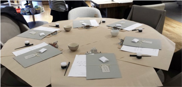
Set up and ready to start…it all looks so inviting!

There were around fourteen of us and the bunch of girls I sat with were really friendly, chatty and all first timers like me; I instantly felt comfortable. It was pretty funny when the first thing we all did before sitting down was take pictures of the table…I wonder how many blog posts are up from this session?

Megan Riera led the workshop and began by telling us a little bit about her background. She then went on to explain that this workshop would be split into three parts. Part one: learning how to use the pen to create different strokes. Part two: copying the alphabet. Part three: writing our chosen word or short phrase. Megan also mentioned that calligraphy is actually pretty difficult when you first start…and she was right, it’s a tricky mistress!

Part one:

It was a bit like Christmas having this lovely bundle of goodies to open and we were all given ink, the pen, a nib, paper and instructions for each section of the workshop.

For the first part we learnt how to use the pen correctly and how to adjust pressure to create different strokes. Key point being, apply pressure on the downstrokes and release pressure on the upstrokes. An additional important tidbit is to keep the nib pointing to the top of the paper as you move your hand up, down & across. Mine kept veering to the left, as if on auto pilot to write; my brain just could not get it.

I  enjoyed this part but the curly-wurly symbols were problematic and I certainly had vortex envy to those who could make these look beautiful…but I was getting there.

Part two:

Symbols and pressures ‘conquered’ we moved on to the alphabet. Watching Megan whip out letters effortlessly was pretty impressive…I’m still trying to master the squiggle!

We all cracked on with copying the alphabet and I loved some of those letters, like C, C is a breeze. However, B became my nemesis…damn it, that’s one tough cookie!

Part three:

We came to the part of the session where we would start putting letters together to make a word or a short phrase. The night before I was thinking about short phrases to use and considered my tag line ‘creating bespoke stationery & other handmade loveliness’. Ha! Well that would have been hilarious and ridiculously long. I just about got to completing ‘Frog & Pencil’…but it’s good to be ambitious, right?

This was probably the most difficult section, stringing letters together. It’s how to join them and deciding which way to write the letter that was hard. To help with this, we were encouraged not to look at the alphabet we had previously been copying as that would hinder the flow and to try to scribe everything organically.

Megan helped me out by writing a few examples of ‘Frog’ to copy (I wonder if you can find which lovely ‘Frog’s’ are hers?) that I found extremely beneficial. I liked the concept of playing with spacing and the letters sitting at different heights alongside varying the lines weight, and I feel this will come after some practice.

The time just flew past and I thoroughly relished my workshop with Quill. The atmosphere was relaxed, everyone was lovely and Megan was supportive; I’d certainly recommend this session to anyone who is thinking about trying calligraphy.

I feel that this would be such a great skill for me to learn, especially for the future of Frog & Pencil. Once I feel confident, I can write pleasingly addressed envelopes for invitations or simply use my own crafted words in my designs; there is plenty of potential.

So with that, I’m going to practice little and often and hopefully it will start to feel more natural in the coming months. Thanks to Megan and Quill London, I had a lovely afternoon learning a new creative skill and I hope to sign up for the next stage soon!

Blog stamp

I’m off to get inky fingers, have a wonderful Sunday.

Cx

Advertisement

Topsy-Turvy Typography

I am a sucker for good typography and I guess that explains why it’s taken me such a long time to figure out what I want when it comes to branding Frog & Pencil.

Thanks to Truly Yours on Twitter, she tweeted about The Hungry Jpeg. Having exhausted my normal typography sites I gave it a look and they have some awesome bundles on offer…and freebies! This in turn led me to Creative Market, where it’s a little like typography heaven and over the past week I must have spent hours looking through thousands and thousands (that’s no lie!) of different fonts.

My incredible hubby (Lewie) is spending most of his free time building my website and together, we now have the bones of the site and it’s looking really lovely. I’m super impressed with his coding skills! However, I’m rather fussy when it comes to design…well, most things really; I’m simply a perfectionist and because of this I’ve been battling with typography choices.

Personally, I love my little frog and her pencil, I think that makes a cute logo. It also expresses my style and what my work is like. So, easy decision, froggy stays. Next step, which font should accompany her? I never, ever thought it would be this difficult to choose one. Lewie and I have spent a lot of late nights playing around with varying fonts and compositions on the website to make it work and I believe we’re almost there; hurrah!

Here is where we started, with the website headers…only a sneak peek though! (Apologies about some poor image quality, most of these are screen grabs.)

Moon Flower Bold

Moon Flower Bold

I found myself saying “well, I don’t hate it…” quite a lot during this process which is a glaring signal that something’s wrong. I love tall, skinny typography styles.  I think they’re quirky and fit in with my design aesthetic, I even used something similar for my wedding stationery. The problem is, I see this look EVERYWHERE. It must be on-trend right now, this font alone had millions of downloads. So, I pondered, ‘do I do something different?’ I decided to just pile in loads of options and see what sticks…and here are just a few examples.

Pier Sans

Pier Sans

To me, this font was pleasing to the eye, clean and sat well with the rest of the website but it lacks a little personality. It was helpful in the fact that it made me evaluate what I wanted my brand to represent. Whichever typographic style I choose it needs to meet the following criteria: to be a little quirky, whimsical, appealing to the wedding market and most importantly fun. My designs are fun and I feel it’s essential that this shines throughout my branding too.

Paper Cute

Paper Cute

Paper Cute is rather charming with its cut out appearance and I do like it, however I didn’t feel it was a good fit.

Bohemienne

Bohemienne

Bohemienne appealed to me with its lovely brush script style however, somehow, I find it a little too perfect and I see flourishes of ‘Disney’ which isn’t what I was looking for.

Sunn

Sunn

With Sunn, I thought I would revisit the skinny script, but this isn’t working for me, perhaps I need something a little more punchy and bold.

Farmers Market

Farmers Market

I like the varying weights in Farmers Market and there is an element of quirkyness but again, I didn’t connect with it.

After experimenting with around twenty fonts, I then added these…

Flow

Flow

Monofor Alt

Monofor Alt

These two were my favourite but I still had those niggles. For example, in almost all my trials it really bothers me that even though everything is centred, the ampersand creates an illusion that, as we would say in Norfolk, everything is ‘on the huh’ (skewed). Alongside that, the tag line also need to fit in nicely and not just hover in space.

With a few coding tweaks we came up with this.

Flow New

Flow New

Monofor Alt New

Monofor Alt New

Albeit a smidge delirious, last night felt like a break through after days of banging my head against a typography brick wall. I find these two really pleasing, a bit like eye candy. I enjoy the way these are weighted with the varying thickness. They also have a nice, fluid movement and are not dead straight. It’s almost as if the frog drew them herself as she hopped along.

There is still work to do; I need to choose a colour, finalise compositions and pick the final font. Luckily, they each cost between $10 to $20, so I’ll probably buy both (an added bonus is that they come with a commercial licence, so they’re ready to use in my designs). That way I can work with them accurately, rather than adjusting a fuzzy screenshot. I also need to consider where else my logo might be used. By working with a business card format, this may help me arrive at a conclusion. With that in mind, I started playing with potential business cards ideas.

Phew! I’m feeling much more positive about my branding now. I was starting to worry that I’d never find the right font and that we’d be working on it for weeks, resulting in something that is forced…I’d hate that. With the end in sight, I’m excited about moving on with the website, business cards and designing product packaging!

Fingers crossed, by the end of the week I’ll have a finished result that I can share with you all. I’d love to hear any of your thoughts or suggestions, please share them with me; I appreciate any feedback.

In the meantime, with all this progress, I’m off to do a little happy frog dance!

Cx